Convert your Figma design into WordPress by cleaning and structuring the Figma file, choosing the right conversion method (manual custom theme, page builder, or AI-assisted), implementing a component-based, token-driven workflow, and validating for responsive performance and accessibility before launch.
why Figma to WordPress matters
Figma to WordPress is the moment a static visual design becomes a living website. Done well, it preserves brand consistency, accessibility, and performance; done poorly, it creates technical debt, slow pages, and a site that’s hard to maintain. This guide walks through every practical step — from preparing the Figma source to selecting the right conversion approach and validating the final site — so you can make the best technical and business decision for your project.
Why starting with a clean Figma file saves time and money :
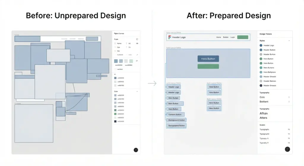
A messy Figma file translates into a messy codebase. Clean files reduce ambiguity, lower back-and-forth with developers, and reduce rework. Investing time in preparation often halves the conversion time and prevents subtle bugs that surface later in production.
Key problems caused by unprepared designs
- Undefined tokens (colors, fonts, spacing) cause inconsistent CSS
- Incorrect or missing layout constraints make responsive behavior unclear
- Poorly named layers add manual work and risk mis-mapping components
- Unoptimized assets (large raster images) hurt page weight and load times
Prepare your Figma file :
A repeatable, tokenized design system is the single best investment before conversion.
Design system and tokens
- Use Local Styles for colors, typography, effects, and spacing. Export to JSON/CSS variables if possible.
- Define a limited set of type scales and spacing scales (e.g., 4pt/8pt base grid) — match these to theme.json or CSS custom properties in WordPress.
- Document state variants (hover, focus, disabled) so interactions are implemented consistently.
Auto-Layout and constraints
- Prefer Auto-Layout frames for components. Auto-Layout maps well to Flexbox and Grid, reducing guesswork for developers.
- Use constraints (left/right/top/bottom/scale) to show how things should behave across breakpoints.
- Provide clear breakpoint examples (mobile, tablet, desktop) in frames so responsive behavior is explicit.
Assets and naming
- Export icons and logos as SVGs; ensure they’re optimized (remove metadata, reduce path complexity).
- Export photos as appropriately sized WebP/JPEG and include multiple sizes (srcset) guidance.
- Rename layers and frames to semantic names: Header-Logo, CTA-Primary, Card-Title, etc.
- Group related components into pages: Tokens, Components, Pages, Assets.
Interaction and motion guidance
- Add simple documentation for complex micro-interactions (timing, easing, entrance/exit). Prefer CSS-native animations over heavy JS when possible.
- Use prototypes in Figma to convey flows (menus, modals, forms), and annotate any non-obvious states.
Choose the right conversion methodology
There are three common approaches. Use the table below to match project goals.
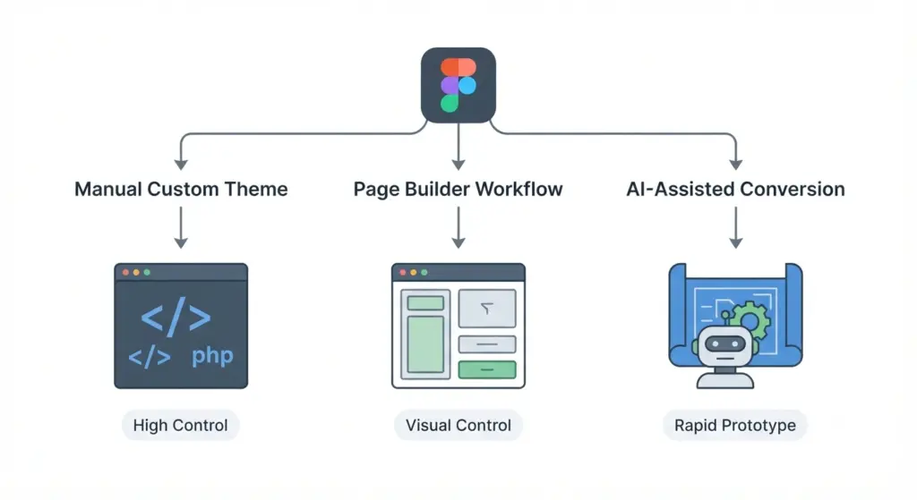
Manual custom theme (best for control and performance)
- What it is: Build a WordPress theme (or FSE block theme) from scratch using PHP (or block templates), HTML, CSS, JS.
- Best for: High-traffic sites, apps, projects that need custom backend logic, or strict performance/security needs.
- Pros: Precise DOM, minimal bloat, full optimization for SEO and speed.
- Cons: Higher cost and development time; needs skilled developers.
When to pick it:
- Long-term product where maintainability and performance matter.
- Projects requiring fine-grained SEO, advanced caching, SSR, or custom APIs.
Practical tips:
- Start from a lightweight starter (Underscores, Sage, Blockbase).
- Build component-first and use theme.json, CSS variables, and a build toolchain (PostCSS, Tailwind, or plain SASS).
- Use ACF, CPTs, or native block types to expose editable fields to editors.
Page builder workflow (Elementor, Bricks, Oxygen)
- What it is: Recreate the design in a visual builder on WordPress.
- Best for: Marketing sites, agencies delivering frequent content updates, or clients who want to edit layouts themselves.
- Pros: Quick for simple sites; non-developers can edit content.
- Cons: Potential plugin bloat, larger CSS/JS payloads, limitations for bespoke functionality.
When to pick it:
- Tight deadlines where design fidelity can be approximated.
- Clients who need a WYSIWYG editing experience.
Practical tips:
- Configure global styles to match Figma tokens (colors, font sizes).
- Build a component library inside the builder (global widgets/templates).
- Audit output CSS/JS and remove unused widgets/plugins to reduce bloat.
AI-assisted and automated conversion
- What it is: Tools parse your Figma file and generate code or blocks. Commonly produces HTML/CSS, Gutenberg markup, or builder layouts.
- Best for: Rapid prototyping, bootstrapping MVPs, or when you want a developer starting point.
- Pros: Fast initial output, reduces repetitive conversion tasks.
- Cons: Generated code often needs cleanup for performance, semantics, and accessibility.
When to pick it:
- Prototyping, early-stage startups, or internal demos where speed beats polish.
Practical tips:
- Treat AI output as scaffold — review and refactor before production.
- Validate generated code for accessibility and SEO structure (heading order, alt text, meta tags).
Professional workflow:
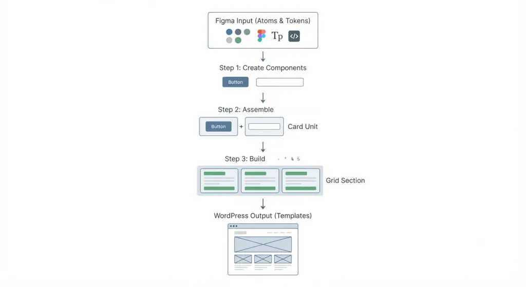
Below is a repeatable pipeline designers and developers use to produce reliable sites.
Phases:
1: Audit and token extraction
- Export design tokens into a JSON or CSS custom properties file.
- Produce a simple style guide: color palette, type scale, spacing, button variants.
- Identify dynamic regions (hero text, blog content, testimonial list) and map them to editable fields.
Deliverables:
- tokens.json / variables.css
- component catalog (buttons, input, cards) with states documented
2: Project scaffolding and dev environment
- Create a starter WordPress environment (local — e.g., LocalWP, Docker).
- Choose the technical stack: block-based (FSE) theme or classic theme with ACF + template parts.
- Set up build tools (npm, webpack/Vite) for asset compilation, minification, and autoprefixing.
Best practices:
- Use Git for version control; separate feature branches for big UI work.
- Use linting (ESLint, Stylelint) and Prettier to maintain consistent code style.
3: Component-based development (atomic design)
- Build atomic components first: Buttons, Inputs, Avatar, Icon.
- Combine into molecules: Card (image + title + excerpt + CTA).
- Assemble organisms: Hero, Navigation, Footer.
- Create templates (Archive, Single, Homepage) that reuse organisms.
Why this helps:
- Changes scale easily. Updating a button updates the whole site.
- Easier QA and unit testing in component-driven environments (Storybook or simple pattern libraries).
4: Content mapping and editor experience
- Create ACF fields, block variations, or reusable templates for content editors.
- Provide editor documentation and example entries to reduce errors.
- Ensure styling in the editor matches front-end (editor styles or block-styles).
5: Performance optimization and asset strategy
- Use responsive images (srcset) and optimized formats (WebP/AVIF where supported).
- Defer non-critical JS, inline critical CSS for above-the-fold content, and use HTTP caching.
- Use font optimization: host fonts or use fast delivery (Google Fonts with font-display: swap).
- Audit with Lighthouse, WebPageTest, or GTmetrix and fix the top issues.
6: Accessibility and SEO validation
- Use semantic heading structure (h1 → h2 → h3) and logical landmarks (main, nav, footer).
- Ensure color contrast meets WCAG AA (or AAA for more strict projects).
- Add aria-* attributes for widgets that require it and ensure keyboard navigation.
- Implement on-page SEO basics: descriptive title tags, meta descriptions, structured data (JSON-LD for articles/products), and clean URL structure.
7: QA, staging, and launch
- Test across real devices and breakpoints; test forms, search, login flows, and third-party integrations.
- Use a staging environment to validate hosting configuration, SSL, redirects, and CDN rules.
- Confirm analytics and tracking pixels are correctly implemented and GDPR/consent rules are honored where required.
Common pitfalls and how to avoid them
Anticipate these and you’ll save time.
Responsive mismatch between Figma and browser
- Solution: Design for multiple breakpoints in Figma; use Auto-Layout and test in real devices early.
Performance degradation after conversion
- Solution: Audit generated CSS/JS, remove unused libraries, convert images, and lazy-load below-the-fold assets.
Accessibility blindspots
- Solution: Add accessibility checks to development workflow (axe, Lighthouse), provide alt text and keyboard interactions.
Unclear content editing experience
- Solution: Provide editors with intuitive ACF fields or block patterns and supply documentation/screenshots for editors.
SEO considerations during conversion
SEO begins in design and continues through development. Make these deliberate choices.
Semantic structure and headings
- Map headings in Figma to actual h1/h2/h3 tags in templates. One h1 per page; use h2/h3 for sections and subsections.
Content-first approach
- Ensure important copy is present in templates (not flattened into images). Text in images cannot be crawled or indexed properly.
Performance as SEO
- Page speed impacts rankings. Optimize Core Web Vitals: Largest Contentful Paint (LCP), Cumulative Layout Shift (CLS), and First Input Delay (FID).
Schema and structured data
- Add appropriate JSON-LD for articles, products, breadcrumbs, and organization markup to improve SERP features.
Mobile-first indexing
- Build and test the mobile experience first — Google predominantly uses the mobile version for indexing.
Choosing tools and plugins (practical recommendations)
There are many modern tools; pick based on your approach.
Starter themes and frameworks
- Block-based: Blockbase (WordPress FSE starter), Twenty Twenty-Three/XX for full site editing.
- Classic starters: Underscores, Sage (if you prefer Blade + modern tooling).
Plugins for content and editor UX
- ACF (Advanced Custom Fields) or ACF Blocks for tailored editing.
- Rank Math or Yoast for on-page SEO management.
- WP Rocket or other caching plugins for performance (or host-level caching/CDN).
Builders (if using page builders)
- Elementor, Bricks, Oxygen — choose based on performance profile, feature set, and developer familiarity. Bricks and Oxygen are often more performant than some alternatives, but they have steeper learning curves.
Automation and AI tools
- Use AI tools as scaffolding only; validate and refactor produced markup. Keep security, semantics, and accessibility checks in place.
Example conversion scenarios (quick decision guide)
These short scenarios help pick a workflow.
Scenarios:
A: Corporate marketing site :
- Custom theme (component-based) with block templates, strict performance optimizations, robust SEO.
B: Small business brochure site :
- Page builder ( Elementor / Bricks ) with careful optimization and minimized plugins.
C: Startup MVP with rapid iterations
- AI-assisted conversion or builder for speed, but schedule a technical refactor once product market fit is validated.
Testing checklist before launch
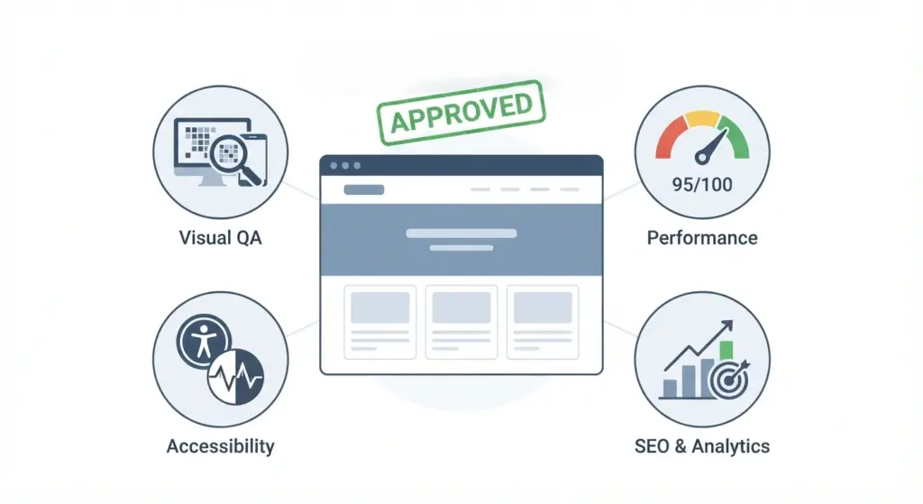
A concise checklist prevents last-minute issues.
- Visual QA: pixel spot-checks against Figma for key breakpoints.
- Functional QA: forms, CTAs, search, logins, and third-party integrations.
- Performance: Lighthouse score > 90 (aim), optimized LCP, CLS < 0.1.
- Accessibility: keyboard navigation, color contrast checks, aria labels, screen reader spot checks.
- SEO basics: unique title/meta, robots.txt, sitemap.xml, schema markup.
- Security & hosting: HTTPS, correct file permissions, backups, and staging deployment tested.
Post-launch: maintenance and iterative improvements
Websites evolve. Plan for maintenance to keep the site healthy.
Monitoring and analytics
- Configure error monitoring (Sentry or equivalent), uptime monitoring, and performance alerts.
- Keep analytics dashboards for behavior, funnels, and sources to guide content changes.
Content governance
- Train editors on the CMS patterns you built. Provide a living style guide (or an internal wiki) that maps Figma components to editor patterns.
Scheduled technical upkeep
- Regularly update WordPress core, theme, and plugins on a staging first.
- Run periodic Lighthouse/a11y audits and resolve regressions.
Real-world tips and best practices
These are practical, battle-tested tips.
- Keep the DOM shallow and semantic. Deeply nested elements increase layout cost and complexity.
- Prefer CSS for animations and micro-interactions; use hardware-accelerated properties (transform, opacity).
- Use CSS containment and will-change sparingly to improve repaint costs.
- Avoid using images for text and decorative shadows that can be achieved with CSS.
- When using web fonts, preload critical fonts and use font-display: swap to reduce CLS.
Example hand-offs and deliverables (what designers should provide)
To make the transition smooth, designers should deliver:
- Organized Figma file with tokens, components, and annotated breakpoints.
- tokens.json or a style guide export (colors, type scale, spacing).
- SVG icon set and optimized images with export presets.
- Prototype links and concise interaction notes for modals, carousels, and other JS-driven elements.
- A page mapping document: which Figma frames correspond to which WordPress templates and what content will be dynamic.
When to involve engineers vs when designers can do it themselves :
- Designers can use page builders or AI tools to create simple pages and prototypes.
- Engineers should be involved for performance-critical projects, custom integrations, or where SEO/accessibility must be guaranteed.
Conclusion :
Converting Figma to WordPress reliably requires a clean, tokenized design file, a clear choice of conversion method aligned with project goals, a component-first development workflow, and rigorous validation for responsiveness, accessibility, performance, and SEO.