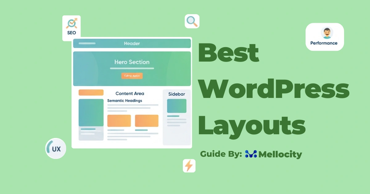
Best WordPress layouts prioritize performance, accessibility, and conversion while remaining flexible and easy to maintain.
Layout :
In 2026 a WordPress layout is not just how things look on the page — it’s the combination of design, code, content structure, and UX that delivers performance, findability, and conversion. This article explains what makes a layout “best” today, walks through proven layout patterns, and gives practical, hands-on guidance so you can choose or build the right layout for your site.
Why layout matters for SEO, UX, and conversions :
A layout affects:
- Search engines: semantic HTML and heading structure help crawlers index and rank content.
- Users: clarity, scanability, and perceived speed influence engagement and conversions.
- Performance: DOM complexity, fonts, scripts and asset loading determine Core Web Vitals.
- Accessibility: correct structure and focus states make content usable for everyone.
Core principles of a high-performing WordPress layouts :
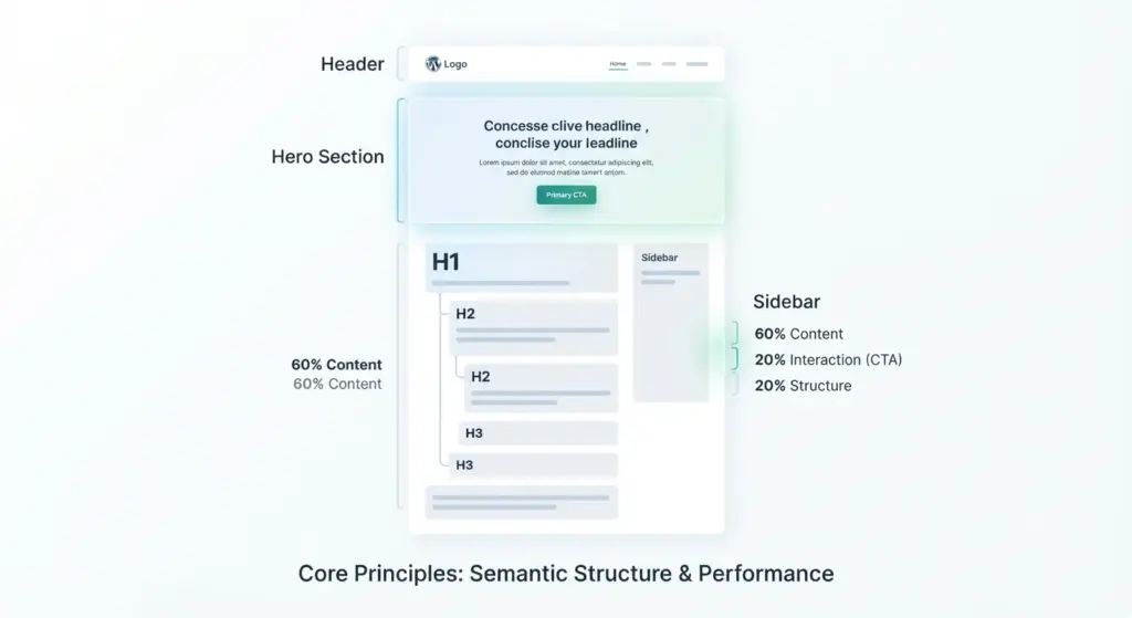
Performance-first design
- Keep DOM shallow — avoid excessive wrapper elements.
- Code-splitting and conditional asset loading: only load scripts/CSS needed for the page.
- Prioritize above-the-fold content to improve Largest Contentful Paint (LCP).
Semantic structure and heading hierarchy
- Follow H1 → H2 → H3 order; use headings to express content hierarchy, not visual style.
- Use HTML5 landmarks: , , , , , for clarity and accessibility.
- Proper headings help search engines and screen readers.
Accessibility and visible keyboard focus
- Ensure clear focus outlines for interactive elements.
- Use ARIA only when necessary and prefer native HTML semantics first.
- Test with keyboard navigation and a screen reader to verify flow.
Conversion-centred architecture
- One primary action per page (clear CTA).
- Value proposition above the fold and near the CTA.
- Place social proof/trust signals close to CTAs to reduce friction.
Responsive and container-aware design
- Responsive is the default; use CSS Container Queries so components adapt to their container, not only viewport.
- Ensure components look right in multiple contexts (sidebars, grids, single-column views).
Popular layout patterns :
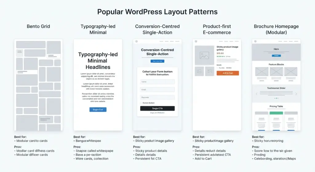
Bento Grid (modular card system)
- Best for dashboards, service pages, feature lists.
- Pros: highly scannable, easy to reorder, localized performance (lazy-load individual cards).
- Use when you need flexible, repeatable content blocks that work across pages.
Typography-led minimal layout
- Best for editorial brands, thought leadership, and portfolios.
- Pros: fewer assets, fast rendering, strong hierarchy through type scale and weight.
- Use variable fonts, system font fallbacks and careful line-length control.
Conversion-Centred Single-Action Layout
- Best for landing pages, product pages, and paid-ad destinations.
- Pros: reduces decision paralysis; guides user to a single conversion.
- Implementation: concise hero, single-column product area or form, minimal navigation on the checkout funnel.
Product-first e-commerce layout
- Best for stores with image-led products (fashion, homewares).
- Patterns: single-column product view with persistent add-to-cart CTA, sticky product gallery, simplified checkout flow (remove headers/footers on checkout).
- Use structured data (Product, Offer, Review) and keep the purchase path shallow.
Brochure homepage (modular storytelling)
- Best for agencies, SaaS homepages, B2B landing experiences.
- Pros: guided storytelling, modular sections for feature, proof, pricing.
- Avoid: excessive length without clear CTAs; prefer paced sections and micro-CTAs.
Choosing a theme or starting point
Start minimal if you care about speed
- Choices: “blank” or lightweight starter themes and block-based foundations that minimize unnecessary markup.
- Approach: use WordPress Block Editor (Gutenberg) patterns and lean utility CSS (e.g., Tailwind) or small-scale custom CSS.
Pick a feature-rich theme if you need speed-to-market
- Choices: modern block-first themes with dynamic content hooks.
- Approach: use theme hooks, reusable patterns, and global template parts to maintain consistency without code changes.
For e-commerce, use a framework optimized for WooCommerce (or relevant platform)
- Choose themes built for commerce performance (optimized gallery, lazy-loaded thumbnails, simplified checkout templates).
- Ensure compatibility with payment and caching plugins.
Practical layout components and how to implement them :
Header and navigation
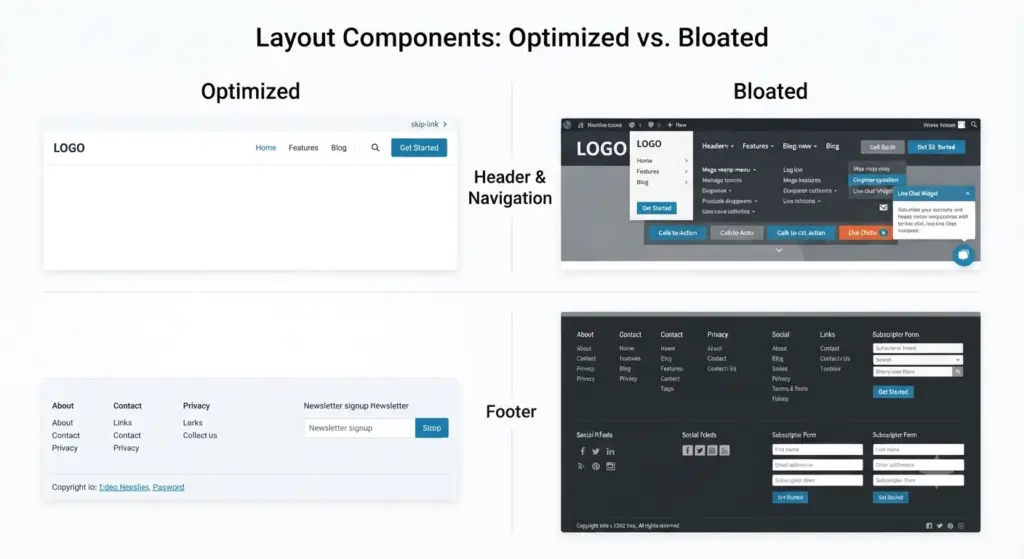
- Keep header height efficient and avoid heavy hero nav behaviors that inject large JS.
- Use semantic nav with skip-links so keyboard users can jump to content.
Hero/above-the-fold
- Make the hero the performance priority: critical CSS inline for hero styles; defer non-critical scripts.
- Keep hero copy short and a single primary CTA.
Content containers and grids
- Use CSS Grid or Flexbox for layout — avoid deeply nested frameworks that add markup.
- Apply container queries to let components adapt to available width.
Sidebars vs. single-column content
- Single-column content often converts better on product and landing pages.
- Use sidebars for secondary pages like blog archives, category pages, or knowledge bases.
Footer
- Consolidate links — large footers with many links add noise and bloat.
- Use server-side includes or dynamic template parts for consistent footer content.
Images and media
- Use responsive images (srcset), modern formats (AVIF/WebP), and proper width/height attributes.
- Lazy-load below-the-fold images and use LQIP (low-quality image placeholders) or CSS-based gradients for perceived speed.
Fonts
- Limit custom web fonts. Use variable fonts or system stacks with font-display: swap to avoid FOIT (flash of invisible text).
- Preload critical font with rel=preload only for the hero typography.
Scripts and third-party assets
- Audit third-party scripts (analytics, tag managers, widgets) and defer or lazy-load them.
- Use server-side or edge-based tag solutions where possible to reduce client overhead.
SEO-specific layout considerations
Heading structure and on-page relevance
- Each page should have a single H1; H2/H3s describe subsections. Use headings to reflect keyword intent naturally (avoid stuffing).
- Keep headings descriptive and user-focused; they help featured snippets and passage indexing.
Schema and structured data
- Implement relevant schema: Article, Product, FAQ, BreadcrumbList.
- Place structured data in JSON-LD in the head or just before closing body — ensure it matches visible content.
Pagination, archives, and canonicalization
- Use rel=canonical for duplicate content and paginate properly with rel=prev/next (where relevant).
- For large archives, consider index/noindex strategy based on quality of aggregated content.
Internal linking within layout
- Make related content discoverable via contextual links and inline CTAs.
- Use breadcrumb UI for deeper structures; it improves usability and search appearance.
Performance checklist for any WordPress layouts
Server and caching
- Use a fast host or edge CDN; serve static assets from a CDN and prefer HTTP/2 or HTTP/3.
- Implement page caching, object caching, and a cache-busting asset strategy.
Asset optimization
- Compress and serve images in modern formats, minify CSS/JS, and concatenate only when it helps.
- Use critical CSS and defer non-critical CSS where possible.
Reduce layout shift
- Reserve size for images and embeds; avoid inserting content dynamically above the fold.
- Use transform-based animations rather than layout-triggering properties.
Lighthouse and Core Web Vitals
- Measure LCP, CLS, FID (or INP) and iterate. Prioritize fixes that improve perceived speed first.
Content strategy tied to layout
Scannable content
- Use clear H2/H3 headings, short paragraphs, bullet lists, and highlight key takeaways.
- Apply visual hierarchy consistently across blocks for predictable scanning.
Matching layout to user intent
- Use landing pages with focused layout for transactional queries; use article layout with in-depth, modular sections for informational intent.
- For multi-intent homepages, show clear paths: “Get started”, “Learn”, “Pricing”.
Reusable block patterns and design system
- Build a small library of reusable blocks (hero, feature list, testimonial, pricing card).
- Use consistent spacing, max-widths, and responsive behavior to reduce design debt and speed up new pages.
Theme and plugin recommendations :
Starter / performance-first themes
- Look for block-theme foundations and lightweight starter themes with minimal markup. (Example archetype: bare block-based starter — pick one that matches your workflow and test it.)
Feature-rich, developer-friendly themes
- Use modern block-focused themes that expose template parts, hooks, and patterns without heavy inline scripts.
Essential plugin patterns (audit before install)
- Performance: caching + image optimization plugins that integrate with your CDN.
- SEO: structured data and sitemap that are lightweight and well-maintained.
- Accessibility: keyboard and focus helpers, skip links generator.
- Avoid plugin overlap — too many UI plugins add styles and scripts that bloat the layout.
Note: choose plugins that support modern block editor paradigms and server-side rendering for dynamic content where possible.
Testing and iteration :
Pre-launch checklist
- Run Lighthouse audits and check Core Web Vitals.
- Keyboard-only navigation and screen reader pass.
- Mobile-first testing across multiple viewport sizes and network throttles.
A/B testing and analytics
- Test CTAs, hero copy, and layout density with an A/B tool or server-side experiments.
- Track engagement metrics (scroll depth, time on page, conversion rate) and correlate with layout changes.
Monitoring post-launch
- Set up RUM (Real User Monitoring) for LCP/CLS/INP to capture real-world performance.
- Keep a plugin/theme changelog monitor; changes can unexpectedly impact DOM or assets.
Common pitfalls :
Overusing page builders without performance guardrails
- Many builders add heavy markup and inline styles. If using them, audit generated HTML and deactivate unused modules.
Styling by heading level only
- Don’t use H2/H3 for visual styling while breaking document structure. Keep semantic hierarchy clean; style via classes.
Third-party widgets without lazy loading
- Many widgets (chat, social, fonts, ad networks) inject blocking resources. Use async/lazy-loading techniques and prioritize essential widgets only.
Too many hero CTAs
- Multiple primary CTAs dilute impact. Keep one clear action and use secondary actions with lower visual weight.
Example layout blueprints :
High-conversion product page (single product)
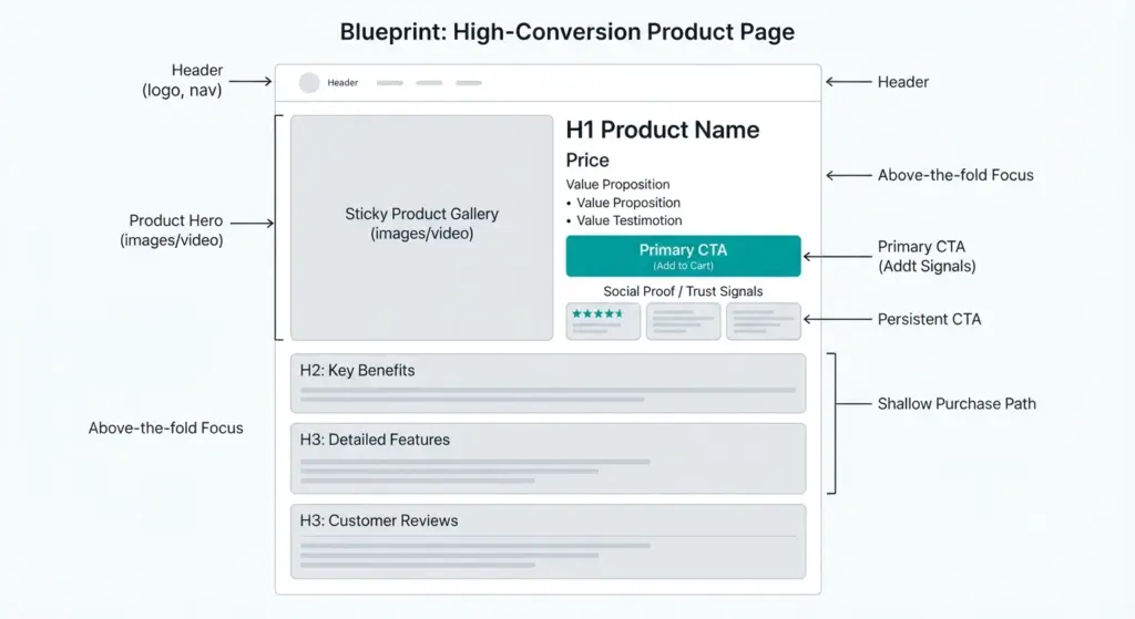
- H1: product name
- Hero: product image left, value proposition and primary CTA right (mobile stacked).
- H2: short benefits
- H3: features (bullet list)
- H3: reviews/testimonials (near CTA)
- H2: related products / upsell
SaaS homepage (conversion-centred)
- H1: single-line value prop
- Hero: 1 primary CTA + visual demo (lightweight)
- H2: how it works (3-step)
- H2: features (Bento grid)
- H2: social proof
- H2: pricing (short) + CTA
Long-form article (SEO and readability)
- H1: exact-match intent title
- Intro: concise answer and quick summary
- H2: what this article covers (TOC)
- H2: main sections with H3 subsections, images with captions, code/quote blocks
- H2: conclusion + CTA (newsletter or related resources)
Tools and workflows for building layouts efficiently :
Design tokens and utility-first CSS
- Create tokens for spacing, colors, type scale; prefer utility classes for faster builds and consistent spacing.
Block patterns and reusable templates
- Save frequently used sections as Block Patterns or Template Parts to maintain consistency and speed up page creation.
Component-driven development
- Build components (cards, CTAs, testimonials) and test them independently with responsive states.
Integrate performance checks into CI
- Run automated Lighthouse checks and asset-size tracking as part of your deployment pipeline to prevent regressions.
Future-forward considerations :
Edge-rendered components and incremental rendering
- Expect more server-side or edge-side rendering of dynamic components to reduce client CPU and JS load.
AI-assisted layouts
- Layout suggestions driven by user behavior and content patterns will become common. Use them as input, not final design — always validate performance.
Privacy-first metrics and on-device personalization
- With privacy regulations and edge compute, personalization will move to device/edge; layouts should be flexible to accept small personalized modules without adding heavy dependencies.
Final checklist :
- Semantic headings and one H1 per page: yes
- Above-the-fold content prioritized and hero CSS inline: yes
- Images responsive, lazy-loaded, and webp/avif supported: yes
- Minimal, audited third-party scripts: yes
- Clear single primary CTA per conversion page: yes
- Keyboard and screen-reader friendly: yes
- Lighthouse and RUM metrics acceptable: yes
If most answers are “yes,” your layout is aligned with current best practices.
Conclusion :
The best WordPress layouts in 2026 are those built with clear intent: fast, accessible, and tuned to user goals. Design trends like Bento grids and typography-led layouts are useful tools, but they should be applied within a framework that respects performance and content hierarchy. Start with a minimal, semantic foundation; build reusable components; prioritize a single conversion goal per page; and measure real user metrics. That approach gives you a layout that not only looks modern but performs reliably and supports growth.